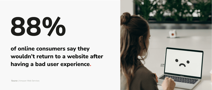
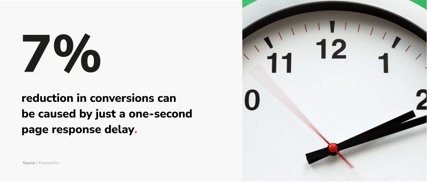
We examine 5 most common UX mistakes that might be scaring your potential clients away. Let’s find out how you can fix them and finally focus on increasing your website conversions.
Mistakes happen. It’s impossible to avoid every single one of them. And there are lessons to be learned from most mistakes. However, some of those lessons might prove to be rather costly. And UX mistakes tend to fall into this category very often, because they cost you your clients.
Good or bad UX is one of the most important factors that determine whether your potential client makes a purchase on your website. Since the internet offers a plenitude of alternatives for almost every single service or product, users just don’t have to be, and often don’t feel like, using sites that are not meeting their expectations. Even if your marketing strategy is serving you well, a badly designed website can be a single weak link that makes the chain break.

While, as we stated, mistakes are unavoidable, it’s always good to be able to identify them in time. Therefore, today we invite you to learn about top 5 UX mistakes that may be costing you your website conversions:
UX mistake #1: Your design is mobile-last.
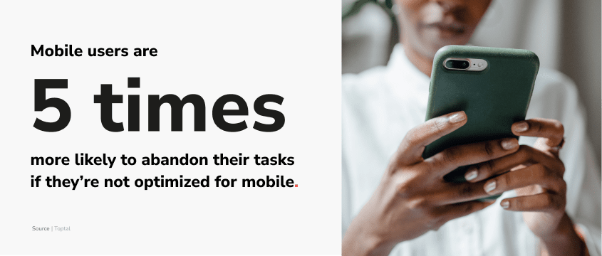
In 2015, traffic coming from mobile devices accounted for just 30% of all website visits worldwide (Statista, 2022). That number grew exponentially in the following years to finally surpass the historic 50% traffic barrier in 2017. While since then its growth rate is steadily declining, surpassing that barrier changed how we should look at the internet.
In anticipation of this moment, Google introduced their mobile first index just a year before. Its implications seemed pretty simple. In the process of evaluating website ranking, the mobile version of websites became the starting point for Google. No mobile site? The rank went down. Badly optimized mobile site? Also bad news.

While today mobile traffic isn’t growing as fast as it used to and its share is just a few percent above a half, mobile-first approach is still strongly favored. Of course, there are still some industries where the desktop is irreplaceable. But there are many more in which a mobile-only approach starts to reign.
In the end, the truth about whether your users use your website on desktop or mobile is very easy to find. It’s right there in Google Analytics. But even if based on your data you choose to prioritize your desktop users, remember that Google will still prefer mobile and might punish you for neglecting it completely.
UX mistake #2: You created personas (or not) but know little about people.
If building your website was preceded by the creation of user personas – that is amazing news. Defining target users of your site before building it seems obvious, yet is still a rare practice. And sadly, very often it is too little to be the key for success.
Even if your personas are very accurate when it comes to your actual users, they still lack one thing that truly makes real website visitors human. They lack unpredictability. It’s very rare that users will use your site how you intended on a very first try. Especially if your site is more complex. Tailoring a precise user journey takes time, it takes changes and most importantly – it takes tests. Tests let you discover mistakes and behaviors that you couldn’t foresee while creating your personas.

Don’t worry, though – tests don’t have to mean huge expenses. In fact, you can start very small with hallway testing. Ask for an opinion of someone who didn’t see your website. Sometimes something seems obvious to us, but it’s enough to consult it with a person with a fresh perspective and have an open head for feedback. This way you can quickly find out how others perceive your idea, without paying for any tests.
Secondly – A/B testing. Of course, you don’t have to be like Google and test 40 shades of blue color on your website’s links right away. (But Google’s experiment is definitely worth reading about, you can do it here.) Here you can also start small. Changing the button copy or color to adding more actionable CTAs can be a very good first step towards increasing conversions. Introducing a culture of constant testing of small changes allows you to continually improve your product, as part of the approach that your work is never done.
And let’s not forget about the ultimate free source of valuable user data. It is of course Google Analytics. If it is implemented on your website, you can go and examine your users paths right away. Observe at what stage they fall off and focus on improving that particular spot first, take care of those users who already shown interest in your product.
UX mistake #3: Your website is incoherent.
While users themselves act unpredictable, what they usually expect from websites is just the opposite – predictability and coherence. Visiting a website is a means to an end. Whether they want to learn about your product or are already determined to purchase it, they want to do it fast and with the least amount of effort.
One factor that might help them achieve that goal is simple navigation. There needs to be a visual order to the page. Good website designers know that the site needs a focal point, and scrolling is supposed to follow an f-shaped pattern because that’s how people read. Navigation bar shouldn’t have any surprises hidden in it, and should be easy to read and easy to follow.
Surprises are generally something you might like to avoid, when creating an experience for your user. Clear language and coherent tone of voice should help you with that. Tell your user what he is supposed to do or see after clicking a button, and what he might expect by moving to another site. And choose one style of communication and design and stick to it.
Of course, good design might seem like something subjective, but in most cases it doesn’t have to be. If your designer doesn’t know or doesn’t follow Nielsen’s 10 Usability Heuristics, it’s very likely that your website is missing out on it. Remember that even if you might enjoy the concept of creative mess, your users probably don’t. And this is where the difference between good and bad design lies.
UX mistake #4: Bad SEO & UX make your site invisible.
The task of increasing the number of conversions on your website might be quite difficult if people aren’t visiting your website in the first place. The first suspect in the low site traffic case? Bad SEO.

SEO or Search Engine Optimization should be one of the key processes when it comes to your digital marketing strategy. It should aim at getting you the maximum number of visits by ensuring a high rank in search engine results.
After all, there is a serious difference between appearing on the first and 5th page of Google. And this difference can be measured in money and opportunities lost. Most people don’t even look past 5th position on the first page of Google, let alone the 5th page.
Unfortunately, many sites still suffer from using outdated SEO tactics, creating content for search engines instead of people, or positioning themselves for the wrong keywords. Your SEO strategy should allow you to find the perfect balance between creating valuable content and keeping the search engines’ bots happy.
And remember that good SEO and good UX go hand in hand!
UX mistake #5: Your website is inaccessible.
Your site doesn’t have to be loved by every internet user, but every internet user should be able to use it. And people with disabilities use the web too. In fact, 1 in 4 of adults in the United States and 1 in 5 adults in Europe have some type of disability (CDC, 2020). If your website design prevents them from using it, you are simply missing out on clients.
It’s also important to note that website accessibility isn’t something foreign or extremely difficult to implement. There are numerous guidelines and tools that will help you check and improve the level of accessibility on your website. Some of these corrections are very basic and can make things easier for people who work with products in unconventional ways. Those factors also make your website friendlier for users without any disabilities. Creating a more inclusive website simply benefits everyone.
And remember that even if you don’t care that your website is inaccessible (even though you definitely should), Google does care. And might lower your rank for creating websites not compliant with Web Content Accessibility Guidelines.

Final word on UX and website conversions
Building a site with good user experience is a never ending journey. While mistakes happen along the way, it is important to identify them and learn from them. Understanding those errors and their impact on user satisfaction, conversion and retention is the first step toward creating a website that people will want to visit.
Today you learned about UX mistakes that are most common, but they do not exhaust the list of all possible traps you might fall into. If you want to dive deeper into factors that might be influencing your website’s performance right now, we would be happy to help you.


